One of the first classes you take as a public history major is centered around how history should be practiced with a public audience in mind. The basic idea is that public history is interactive: the people who see your work are just as much a part of the story as the subjects are. Seems pretty simple, right?
Now, as a junior, this process has become a lot more complicated. So many different factors contribute to the final version of project: the layout of a design, the emotions conveyed through color and font, the appeal of information, the kinds of media used and how they are organized. The list goes on and on. One has to balance visual elements of a design with how effective it is at communicating with its audience (which is the whole point of creating it in the first place). The goal is to draw people in when they first see the project so they feel compelled to read and understand it.
This semester I decided to take a graphic design class. I have always wanted to be an exhibit designer, but had never really explored the actual process of creating something for public use. This class not only helped me understand different tools of design like the Adobe Creative Suite, but also taught me a few lessons about the importance of visual communication.
Images carry weight. They carry emotion and hold attention far longer than words are able to. Some 90% of the information we take in and remember is visual. Regardless of whatever text is used, it is visual appeal that draws in people. The way something looks is like a first impression: if it peaks your interest, you want to know more. The most important thing to remember about graphic design, however, is that form follows function. Your message should drive your project so that people see your intentions within your design.
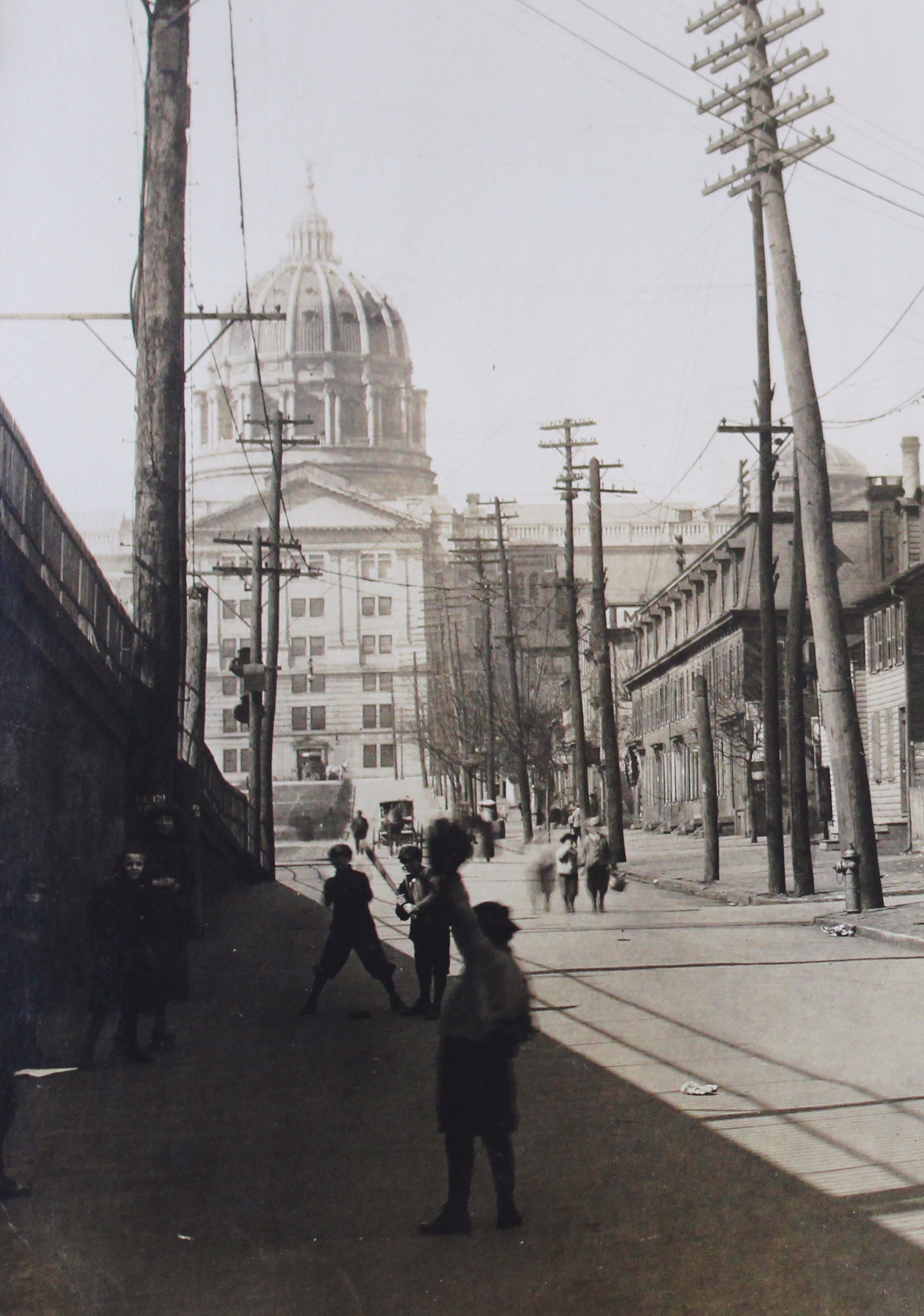
West Avenue from State Street looking North. (Pennsylvania State Archive, RG17)
Public history is all about presenting stories with which people can connect. When someone sees a big block of text or many panels with the same organization, they lose interest quickly. Unfortunately, we don’t always have a huge variety of artifacts to choose from. But this doesn’t mean the ones we have can’t be showcased. Every little piece of history, whether it be a letter or a photograph or maybe even a pair of glasses, belonged to someone and contributes to their story in one way or another. By bringing these objects into the conversation, we can give voice to their creator. The exhibit then becomes a conversation between the subject and audience.
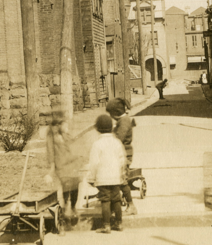
The Digital Harrisburg Initiative has been working hard to identify and catalog photos of people in the Old 8th Ward. These collections may seem simple at first, but I personally believe they give new insight into the ward. Without its people, it’s just a plot of land. Placing these individuals back into their streets brings life into the history. They are the piece that connects the audience to the past and leave them searching for a story.
The entire point of projects like the Commonwealth Monument Project, Look Up, Look Out, and the People of the Old 8th Ward gallery is to call attention to parts of history which traditionally have been overlooked. We want people to able to identify with this part of past, seeing it as something worth investigating.
Designing history is about giving people a visual story they can relate to. It’s about showing them a past that’s alive through the stories we tell.
